Healthcare Website Concept
Maganda
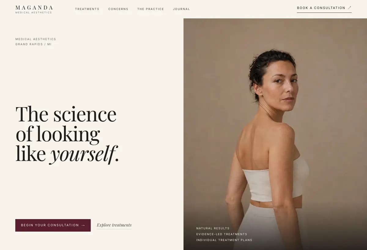
A premium MedSpa website concept shaped around the questions patients ask before they are ready to book—not around a generic list of treatments.
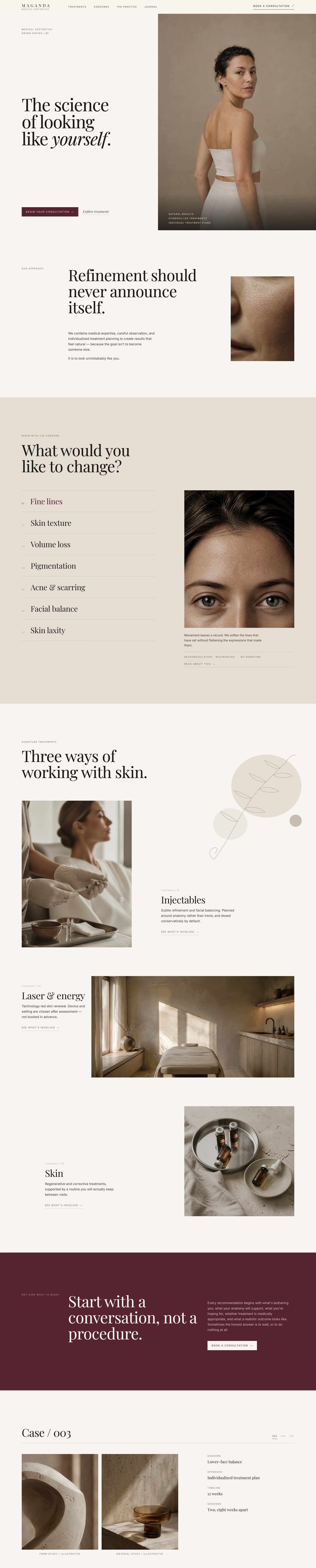

Responsive product preview
Patient journey
Start with what the patient is trying to decide.
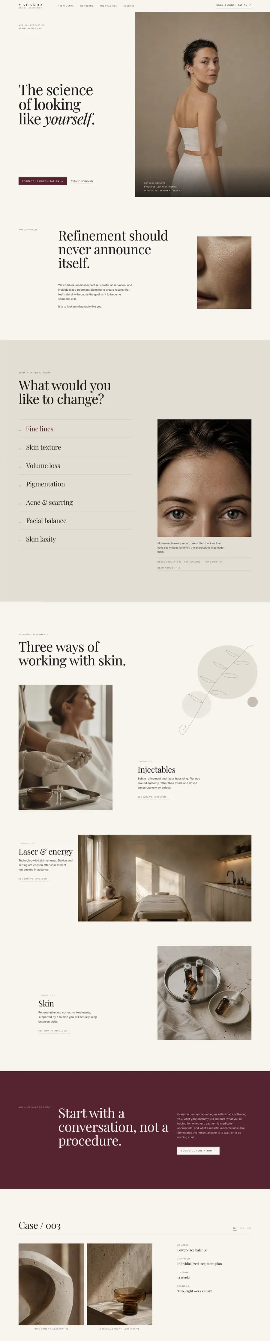
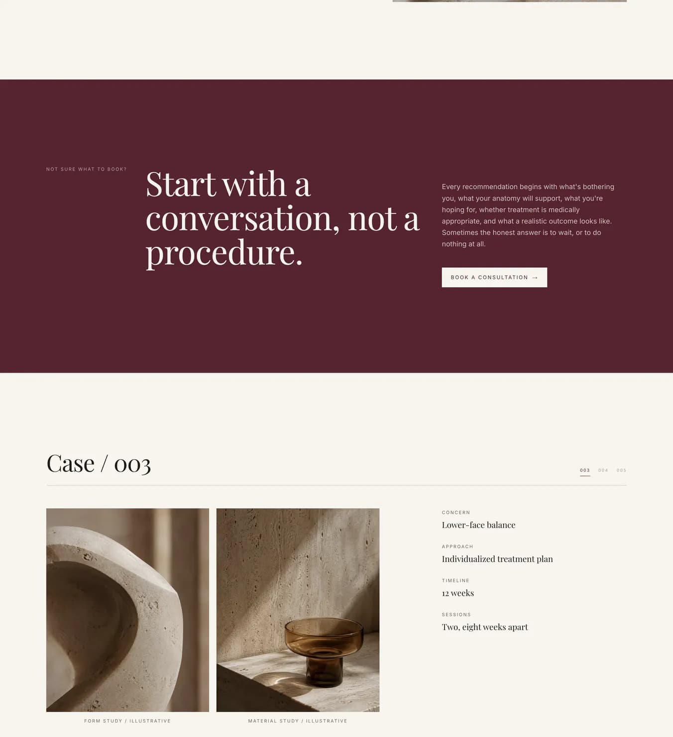
The interface moves from concerns to treatment paths and then to a consultation. It gives patients useful context before asking them to book, while keeping the experience calm and visually focused.
Tech stack
- WordPress
- Bricks Builder
- Content architecture
- UX strategy
- Conversion planning
- GA4-ready measurement
The platform supports structured, reusable page building and practical ownership. The strategic system—not the builder—is the core deliverable.
The problem
A polished treatment menu still leaves patients unsure.
MedSpa websites often organize the experience around internal service categories. Patients arrive differently: comparing safety, looking for natural results, checking whether a treatment fits their skin or goals, and deciding whether a consultation is worth the next step. Maganda reframes the website around those decision journeys so visual polish supports clarity, trust, and action.
Walkthrough
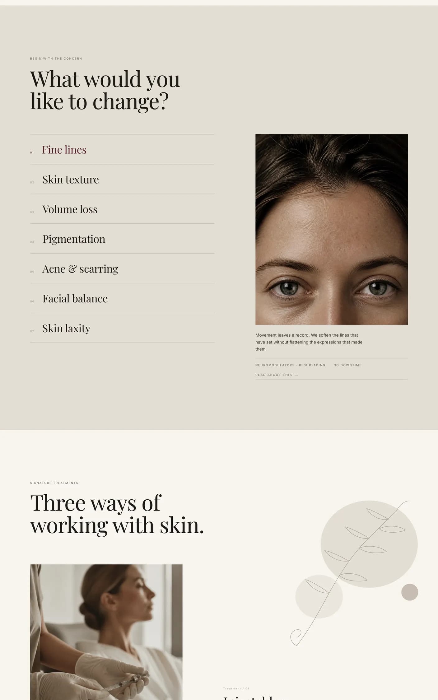
Concern first, treatment second.
The discovery section stepping through all seven concerns. Each one answers with its own imagery and a short, plain explanation, so a patient can recognise their own situation before any treatment page asks anything of them.
Structural decisions
01
Patient intent before page layout
The architecture begins with six audience-and-intent paths, including first-time patients comparing providers, repeat injectable patients seeking natural results, hair-removal patients weighing sessions and skin-tone suitability, and wellness prospects checking eligibility. Those questions determine what content appears and where.
02
Treatments connected to decisions
Treatment pages are not isolated descriptions. Each one connects candidacy, expected experience, related concerns, provider trust, and a clear consultation path so patients can move from interest to an informed next step.
03
Editorial without sacrificing usability
The art direction uses strong typography, intentional whitespace, restrained interface elements, and image-led composition. The design remains readable and navigable on mobile instead of treating editorial styling as decoration.
04
A system that can improve
Reusable treatment, concern, provider, proof, and call-to-action patterns make future additions consistent. Measurement is planned around meaningful actions such as consultation starts, calls, and successful form submissions—not superficial traffic alone.
State today
A strategy-led concept, not a results claim.
Maganda is an independent concept project created to demonstrate the process behind a premium healthcare website: audience research, patient-journey architecture, content structure, art direction, conversion planning, and a maintainable component system. It is not presented as commissioned client work, and no performance results or patient outcomes are claimed.
Start a project
Have a project taking shape?
If you’re working through a website or product problem, I’d be glad to hear what you’re building.