Community Project
Allegan Assembly
A self-initiated church website built around the questions a first-time visitor asks before deciding to walk through the door.
Tech stack
- Next.js
- React
- TypeScript
- Responsive CSS
The case study reflects the currently published website. The work is presented as a community project, with no paid-client or performance claims.
The problem
Church information is not the same as a welcoming path.
A church website often has to serve two very different audiences at once: regular attendees looking for ministries, events, sermons, or giving, and newcomers deciding whether they will feel comfortable visiting at all. If every page carries equal weight, the first-time visitor has to assemble the experience for themselves. The website needed a clear path from uncertainty to a confident next step without making the church feel corporate or impersonal.
Walkthrough
From the home page to a first visit.
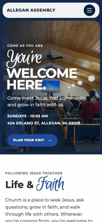
Silent capture of the published site on a phone: the home page, the paths through belief, prayer, community, and ministries, then the Plan Your Visit route to the connection card. Nothing is entered into the form.
Structural decisions
01
Lead with the first visit
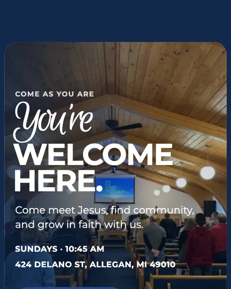
Service time, location, and a direct Plan Your Visit path appear early and repeatedly. The experience answers the practical questions first so a newcomer does not have to search through church language or organizational pages.
02
Organize around human needs
Prayer, community, ministries, events, sermons, and giving are presented as distinct next steps. The structure supports people who need care, people looking for connection, and people ready to participate without forcing all of them through the same journey.
03
Make belief clear and readable
The beliefs page translates doctrine into concise, plain-language sections while linking to the denomination’s complete statement. It preserves theological clarity without turning the website into a dense document.
04
Use warmth without visual noise
Large editorial typography, generous spacing, restrained color, and clear calls to action create a recognizable identity while keeping the content calm, accessible, and easy to scan on mobile.
05
Treat connection as a real system
The visit, contact, and prayer paths collect only the information needed for follow-up, explain how information will be used, and give each request a clear destination beyond the page itself.
State today
Published and serving the church today.
The responsive website is live with visitor planning, ministry discovery, events, sermons, prayer, contact, giving, privacy, and belief content. This was a self-initiated community project, not paid client work. No traffic, attendance, or conversion results are claimed; the case study documents the strategy, information architecture, and shipped experience.
Start a project
Have a project taking shape?
If you’re working through a website or product problem, I’d be glad to hear what you’re building.